Careers Page
Built for a creator marketplace scaling quickly, just before a major platform pivot.
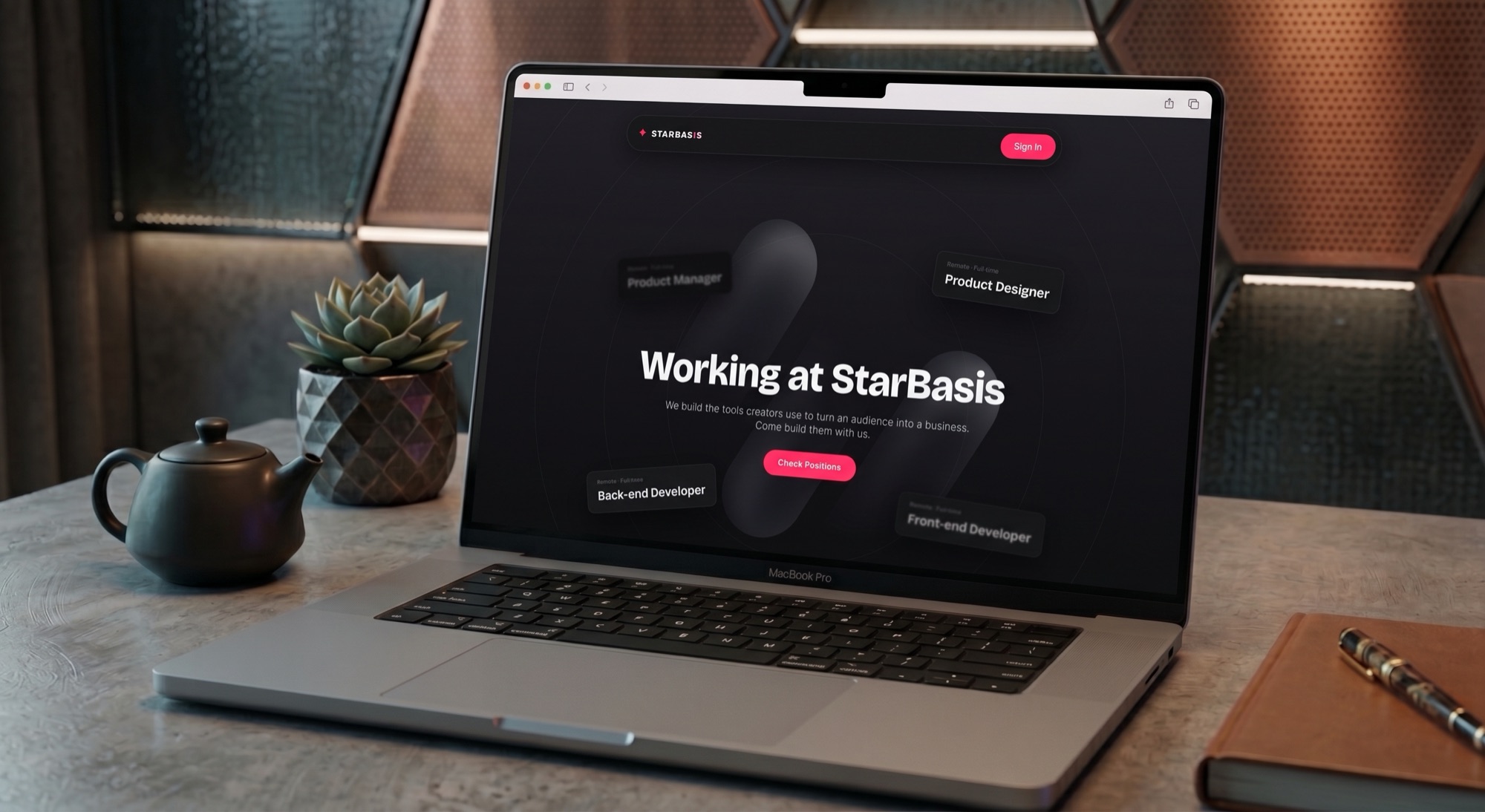
- Role
- Sole Product Designer, end to end
- Scope
- Hero, Benefits, Team, and Open Positions
- Timeline
- 2024
- Platform
- Responsive web, designed in Figma
A company in transition, hiring for what came next
StarBasis is a pseudonym used for confidentiality. The company ran a platform where fans could book paid experiences, calls, and shout-outs with well-known people. After securing a new funding round, it was preparing to expand into a broader creator platform with payments, webinars, communities, and other digital products.
The company needed to grow its team, making the careers page an important first touchpoint for potential candidates. The page needed to communicate the company's culture, attract the right people, and work seamlessly across devices.
Research first, structure before visual design
I took the page through a full design process in Figma, focusing on the structure and content before moving into visual design.
- 01
Research
Studied how companies in the space presented their culture, teams, benefits, and open positions.
- 02
Sketches
Explored different ways to present the team and benefits before settling on a direction.
- 03
Wireframes
Defined the page structure around four core sections: hero, benefits, team, and open positions.
- 04
Validation
Validated the structure before moving into the final UI.
- 05
Final UI
Designed every section across desktop, tablet, and mobile breakpoints.
Four sections, each with a clear purpose
I delivered the complete Figma file, covering every section and breakpoint. Beyond the original brief, I also built a coded, interactive version with Claude.
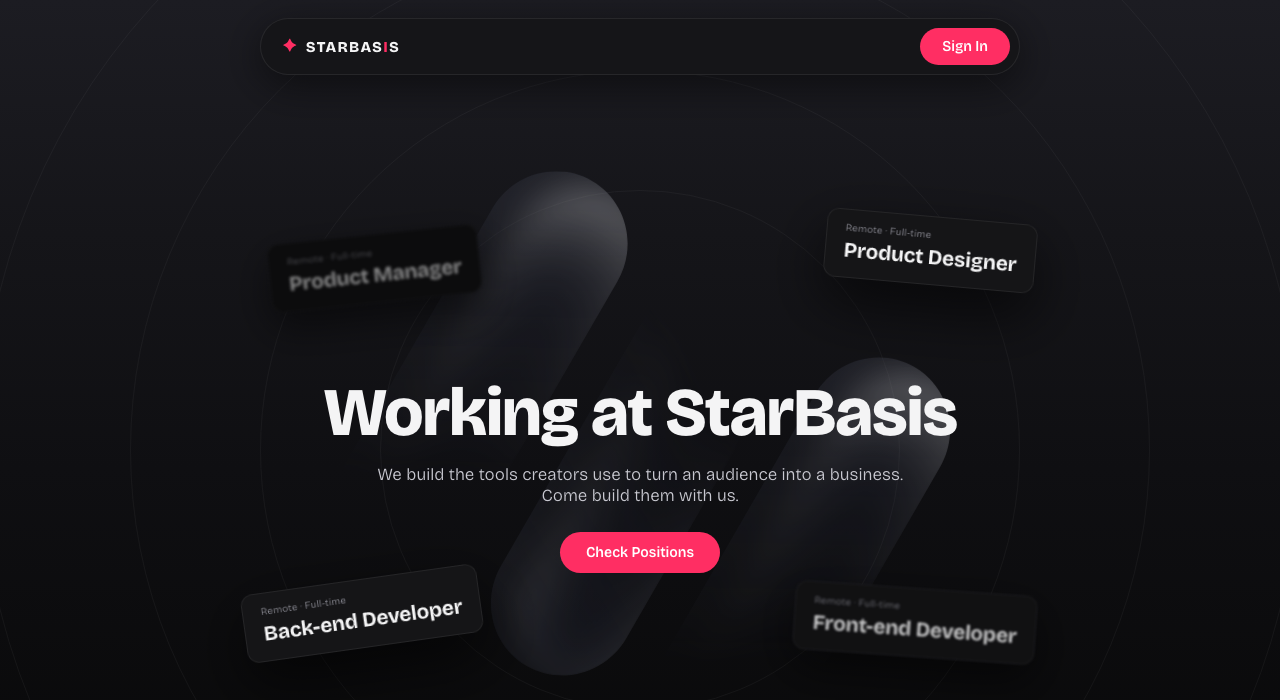
Hero
Interactive job cards respond to the cursor, with a soft capsule shape creating movement in the background.
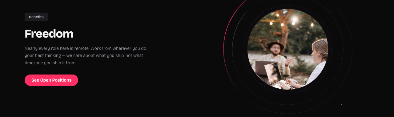
Benefits
A clear reason to join the company, presented alongside a portrait that carries the same visual language as the hero.
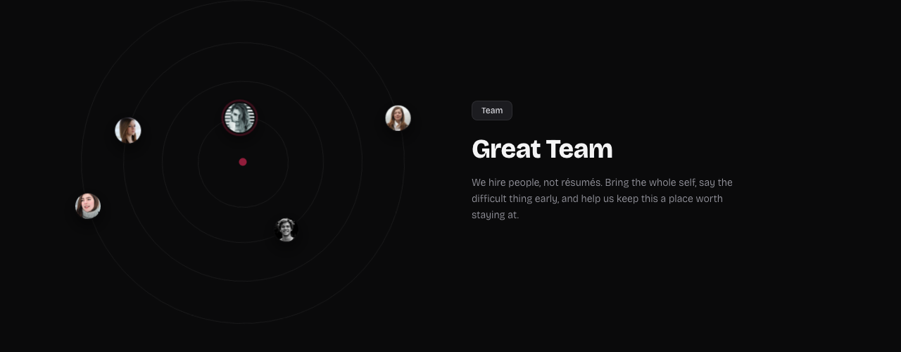
Team
The team is presented through an orbital layout, with each person moving along their own ring.
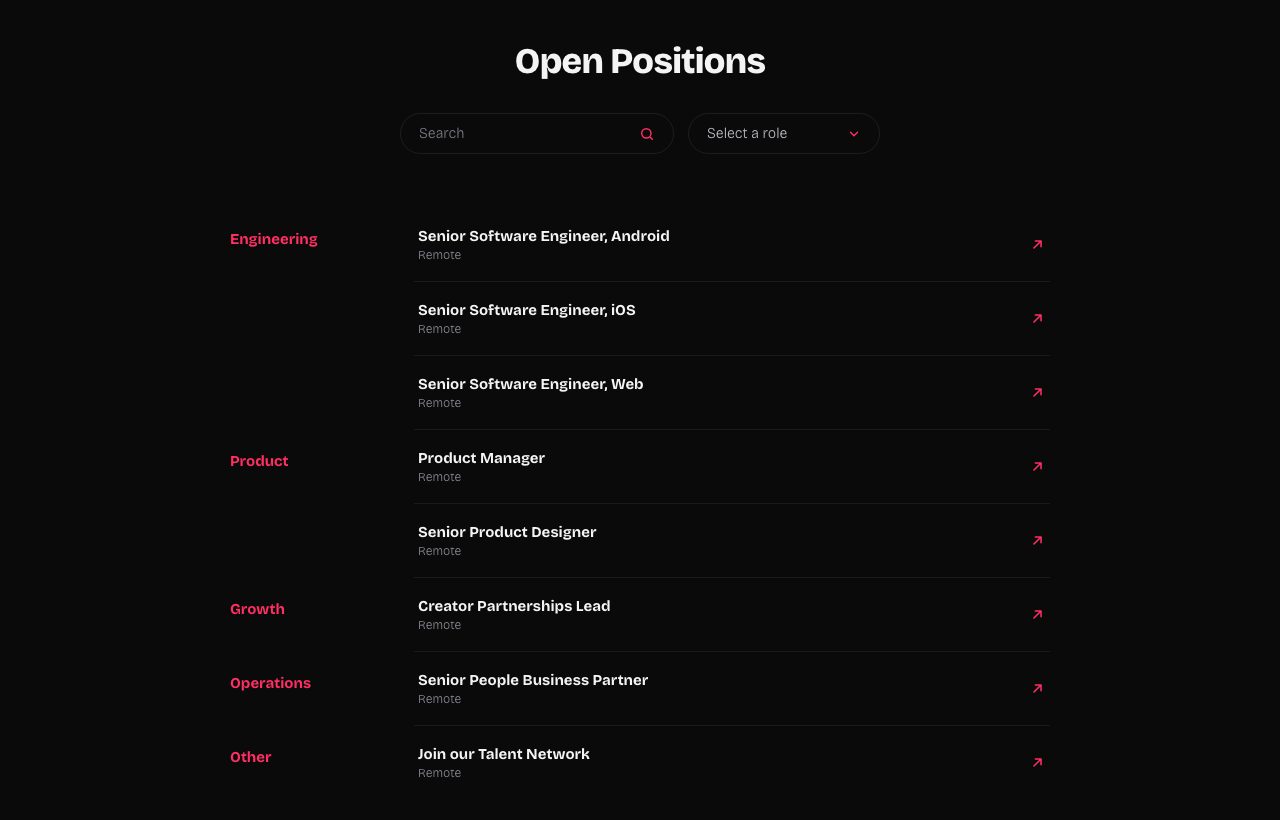
Open Positions
A functional list of available roles with search and department filters, making it easy for candidates to find relevant opportunities.
A careers page that supported the company's next chapter
The page helped the company attract and hire the people it needed for the pivot, and the new creator platform went on to launch.
The final experience combined clear information with a distinctive visual identity, giving candidates a better sense of the company, its people, and the opportunities available.
See it in motion
Explore the live experience, including the interactive hero, orbiting team section, and searchable open positions.
View interactive buildHave a company worth skyrocketing?
I'm open to full-time roles and looking to join a team where I can bring a decade of product design and make a meaningful impact. If you're hiring, I'd love to hear about what you're building.