- Role
- UX Researcher & Designer, solo
- Focus
- WCAG 2.1 accessibility audit
- Timeline
- 2021
- Platform
- Mobile app · Uber
An app that works for most riders, but creates unnecessary barriers for older users
This was a self-initiated study evaluating the Uber app against WCAG, with a particular focus on the needs of senior users.
The research revealed a pattern of small usability and accessibility issues that could make the experience harder to navigate: poor legibility, unclear actions, ambiguous arrival times, limited feedback around payment methods, and layouts that broke when larger system font sizes were used.
These issues can affect any rider, but they become more significant for people who rely on larger text, clearer hierarchy, and more explicit interactions.
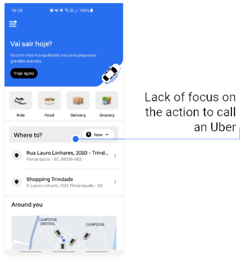
The primary action was difficult to find
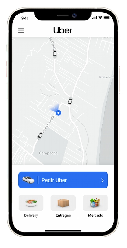
The main action, requesting a ride, sat below a promotional banner and several category tiles. The service most riders opened the app to use was not the most prominent element on the screen.
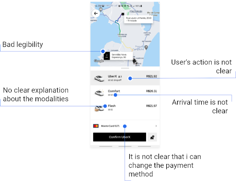
Important information was difficult to understand
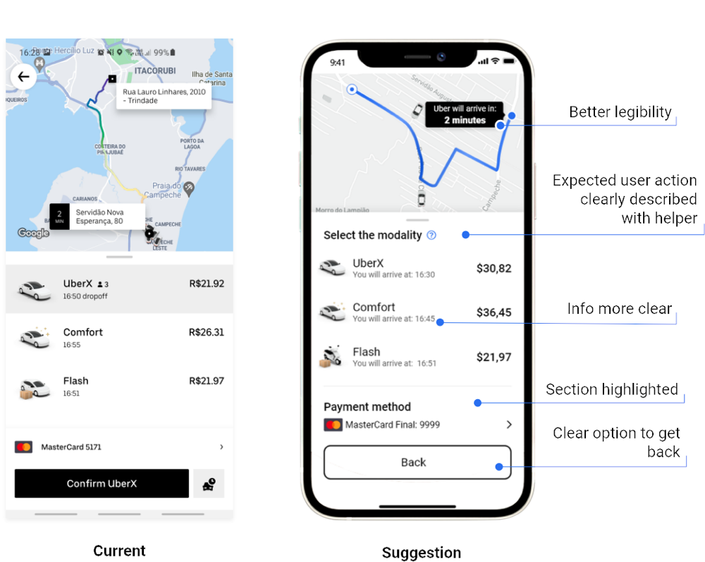
Map labels were hard to read, ride types lacked clear explanations, arrival times were ambiguous, and there was no obvious indication that the payment method could be changed.
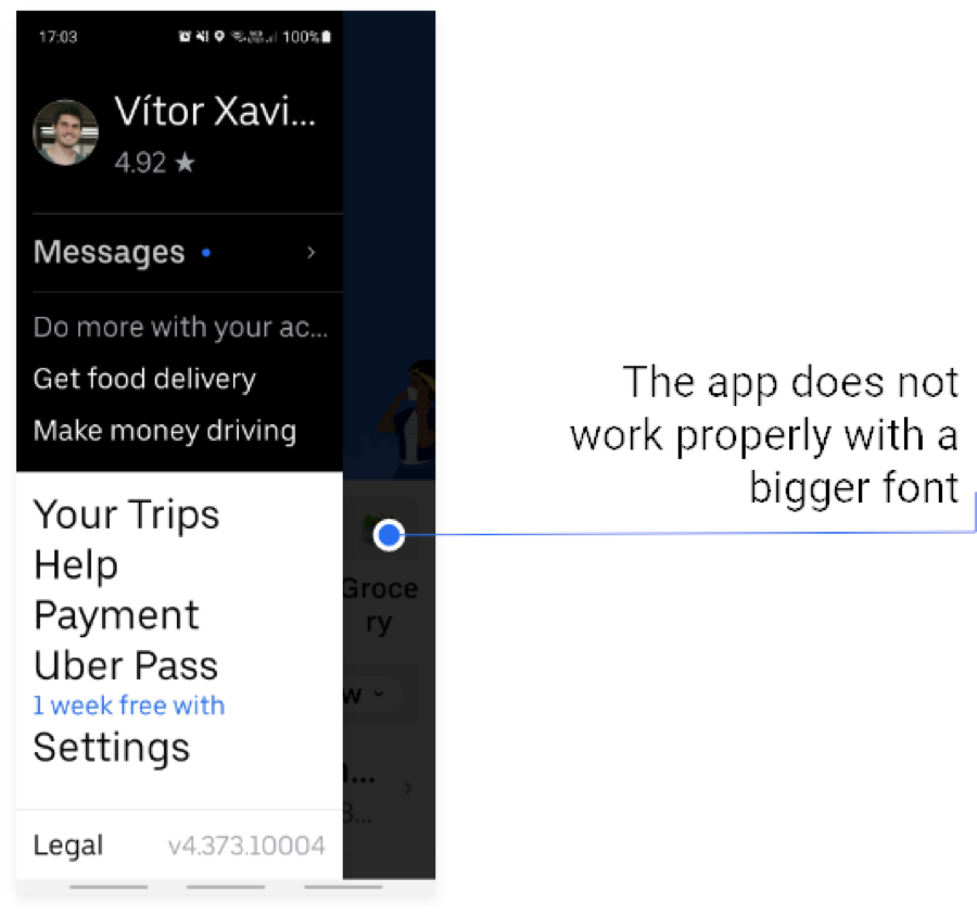
The interface broke at larger font sizes
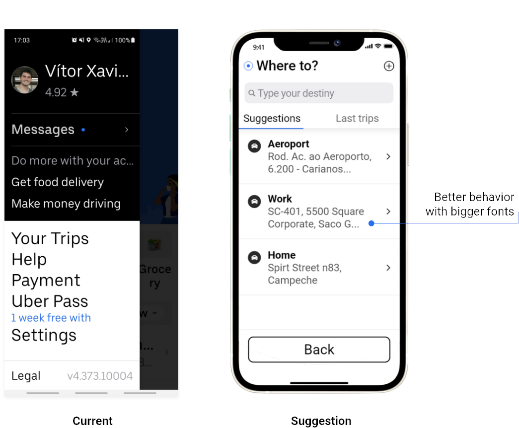
When the system font size was increased, labels became truncated and the panel collided with the content behind it.
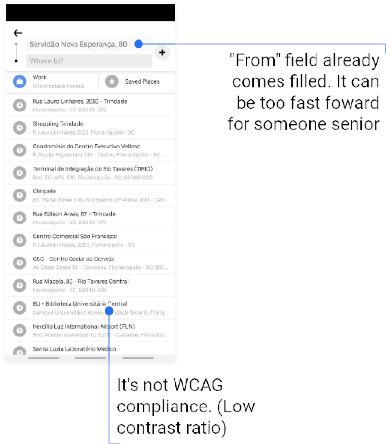
The experience made assumptions for the user
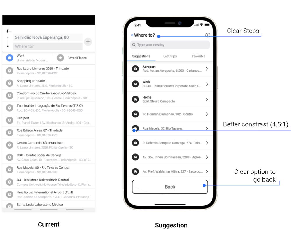
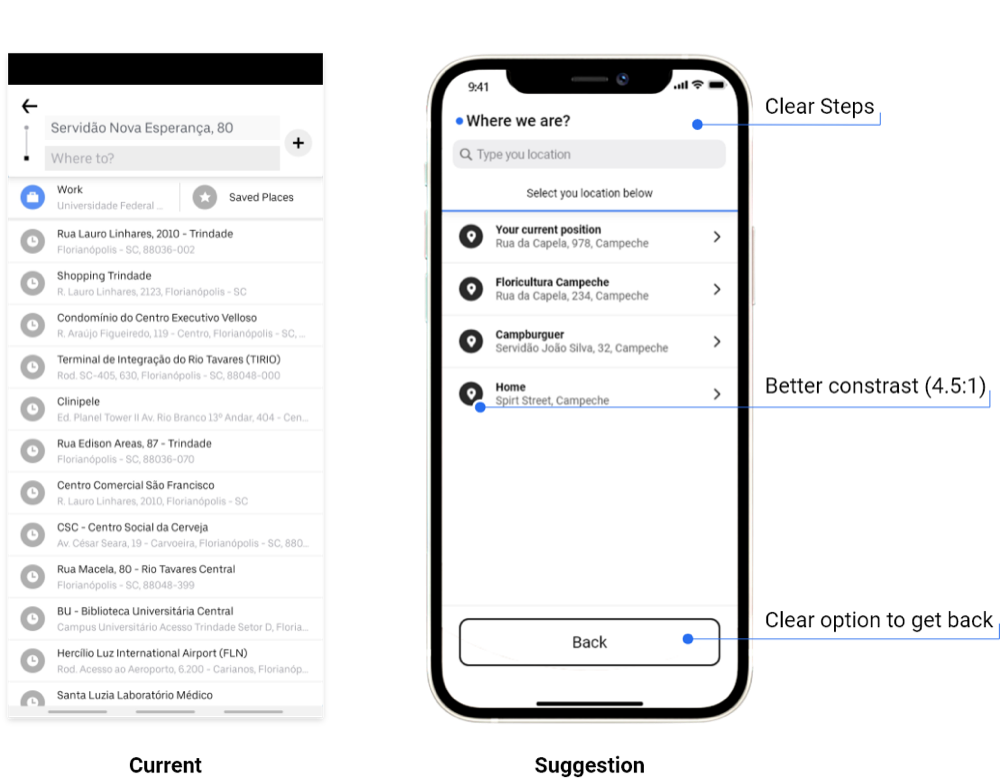
The origin field was automatically filled, while the results list failed the required contrast ratio.
Use WCAG criteria to guide the redesign
I used WCAG as the framework for evaluating the existing experience, then rebuilt the core ride request flow as a series of wireframes.
Three criteria directly shaped the redesign:
- 1.4.3
Contrast (Minimum)
Text and interactive elements were checked against the minimum contrast ratio to improve legibility for users with low vision.
- 1.3.5
Identify Input Purpose
Form fields were labeled so their purpose could be identified programmatically, supporting autofill and assistive technologies.
- 2.4.6
Headings and Labels
Headings and labels were written to clearly describe their purpose, making navigation easier for users, including those using screen readers.
Wireframes
The request flow was rebuilt one step at a time, from requesting a ride through selecting a destination, choosing a ride type, and confirming the trip.
The goal was to establish a clearer hierarchy and interaction model before moving into the final UI.
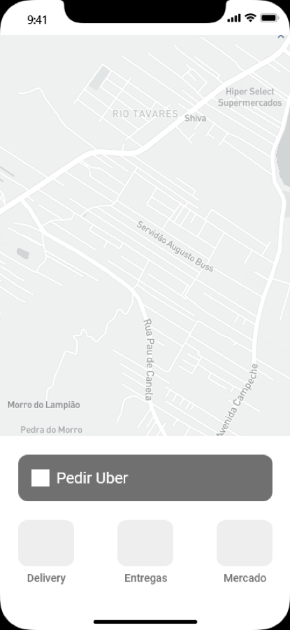
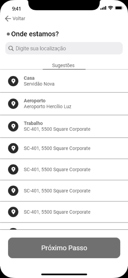
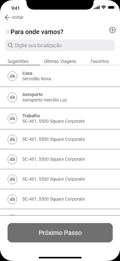
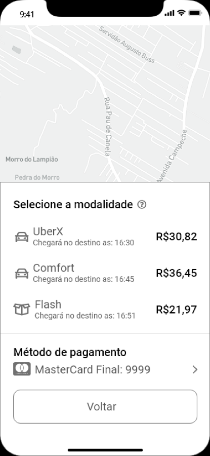
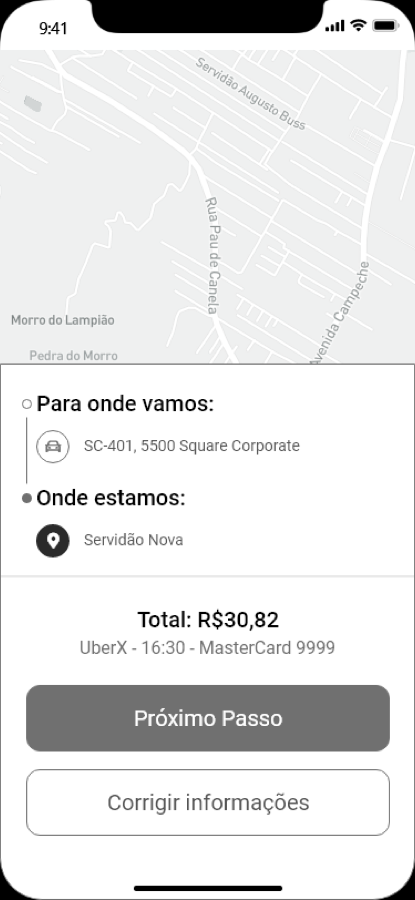
Larger targets, clearer actions, and an interface that holds up at larger font sizes
The final redesign carried the accessibility improvements across the entire request flow, with a focus on touch target size, hierarchy, legibility, contrast, and clearer language.
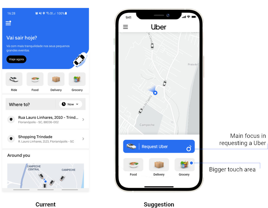
One primary action, with a larger touch target
Requesting a ride became the most prominent action on the screen. Other services were moved into secondary tiles with more space between interactive elements.
The layout remains usable at larger font sizes
Labels wrap instead of truncating, allowing the interface to remain usable at the system font sizes a senior rider may rely on.
Information is easier to scan and understand
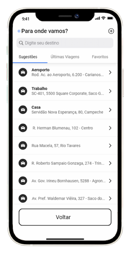
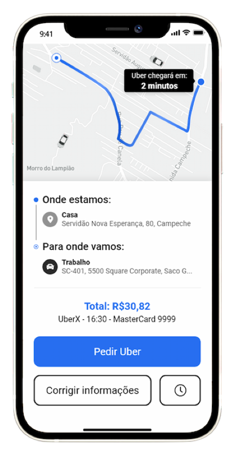
Arrival times are written in plain language, prices and times are clearly separated, the payment method has its own section, and a clear way back is always available.
Contrast raised to 4.5:1
The results list meets the minimum contrast ratio, the current step is clearly identified, and the option to go back is visible instead of relying on an unclear interaction.
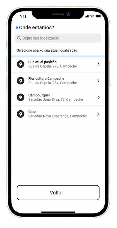
The step is clearly identified, without assuming the user's choice
Instead of automatically filling the origin, the interface explicitly asks where the rider is and lets them choose from the available locations.
A redesigned ride request flow, from start to confirmation
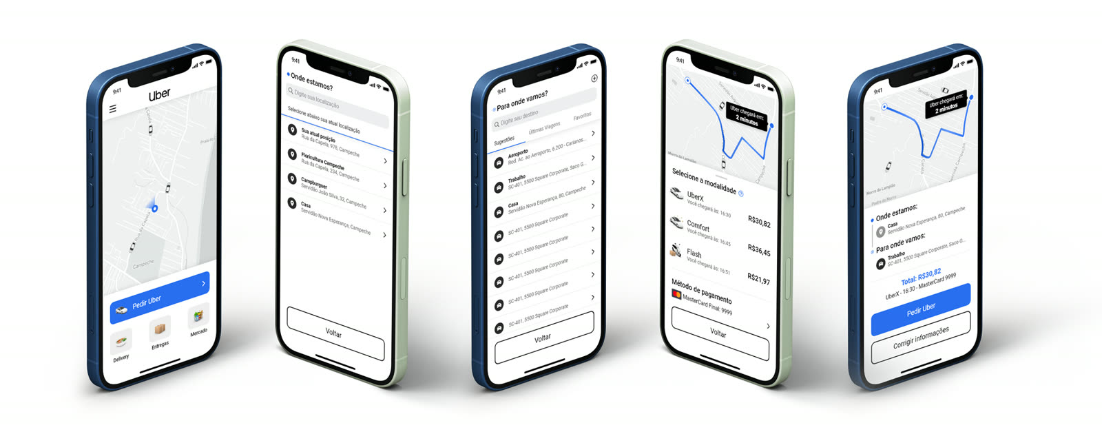
The final screens bring the accessibility improvements together across the complete experience, including the home screen, origin and destination selection, ride selection, and confirmation.
The result is a simpler interface with clearer actions, larger touch targets, stronger contrast, and better support for users who rely on larger text.
Have a company worth skyrocketing?
I'm open to full-time roles and looking to join a team where I can bring a decade of product design and make a meaningful impact. If you're hiring, I'd love to hear about what you're building.