CreatorHub
A marketplace designed to make creator experiences easier to understand, compare, and trust.
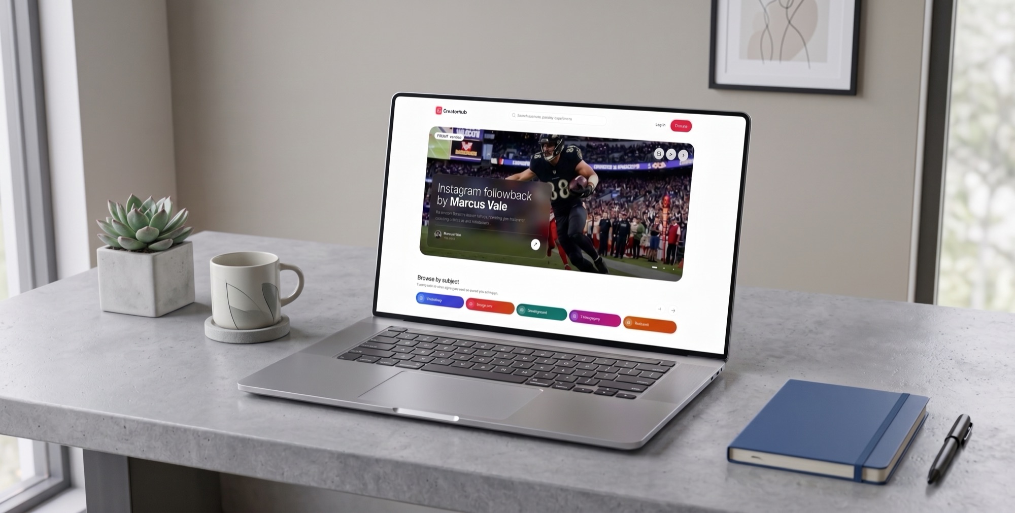
- Role
- Sole Product Designer, end to end
- Scope
- Marketplace UI
- Timeline
- 2025
- Platform
- Responsive web
A marketplace where trust was essential to conversion
CreatorHub is a name changed here for confidentiality. The company offered paid experiences with well-known people, alongside courses, webinars, and other digital products. The marketplace brought these offers together in one place.
The challenge was not simply making the marketplace look better. People were being asked to spend real money on experiences with creators they often only knew through a screen. The interface needed to make the offer feel clear, credible, and worth the price.
My goal was to improve the experience from discovery to purchase while creating a stronger foundation for conversion.
Understand what buyers need before they commit
I started by researching how other marketplaces presented similar offers and what information buyers needed before making a purchase.
Three needs consistently stood out:
Price: People needed to understand the cost before clicking into an offer.
People: Real photography and clear creator information made the marketplace feel more personal and credible.
The offer: Buyers needed to understand exactly what they were getting before committing.
I translated these findings into the page structure, then validated the wireframes with both the company and its users before moving into the final UI.
- 01
Research
Studied comparable marketplaces and how they presented creators, products, pricing, ratings, and other trust signals.
- 02
Wireframing
Explored the information hierarchy and page structure at low fidelity, focusing on what users needed to understand before purchasing.
- 03
Validation
Shared the wireframes with the company and users, using their feedback to refine the structure and content.
- 04
Final UI
Built the validated structure into the final responsive interface, including typography, imagery, cards, navigation, and supporting components.
A marketplace organized around the information buyers need most
I designed each section around three questions a buyer should be able to answer quickly:
Who is this? What am I getting? How much does it cost?
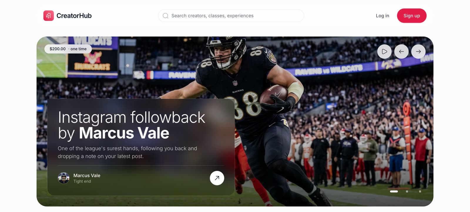
Hero
A featured experience with the creator, offer, and price immediately visible. The use of real photography also helped make the experience feel more personal and credible.
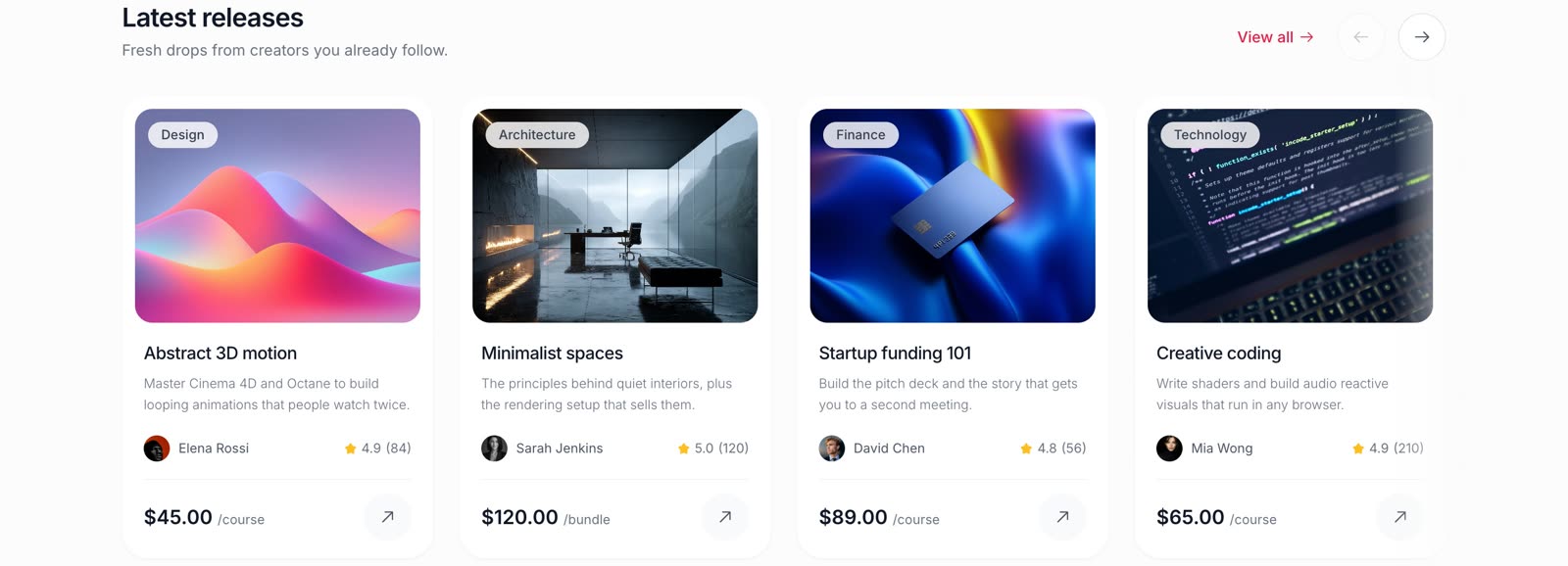
Latest Releases
A collection of recently published courses and products, with the creator, rating, and price visible before entering the detail page.
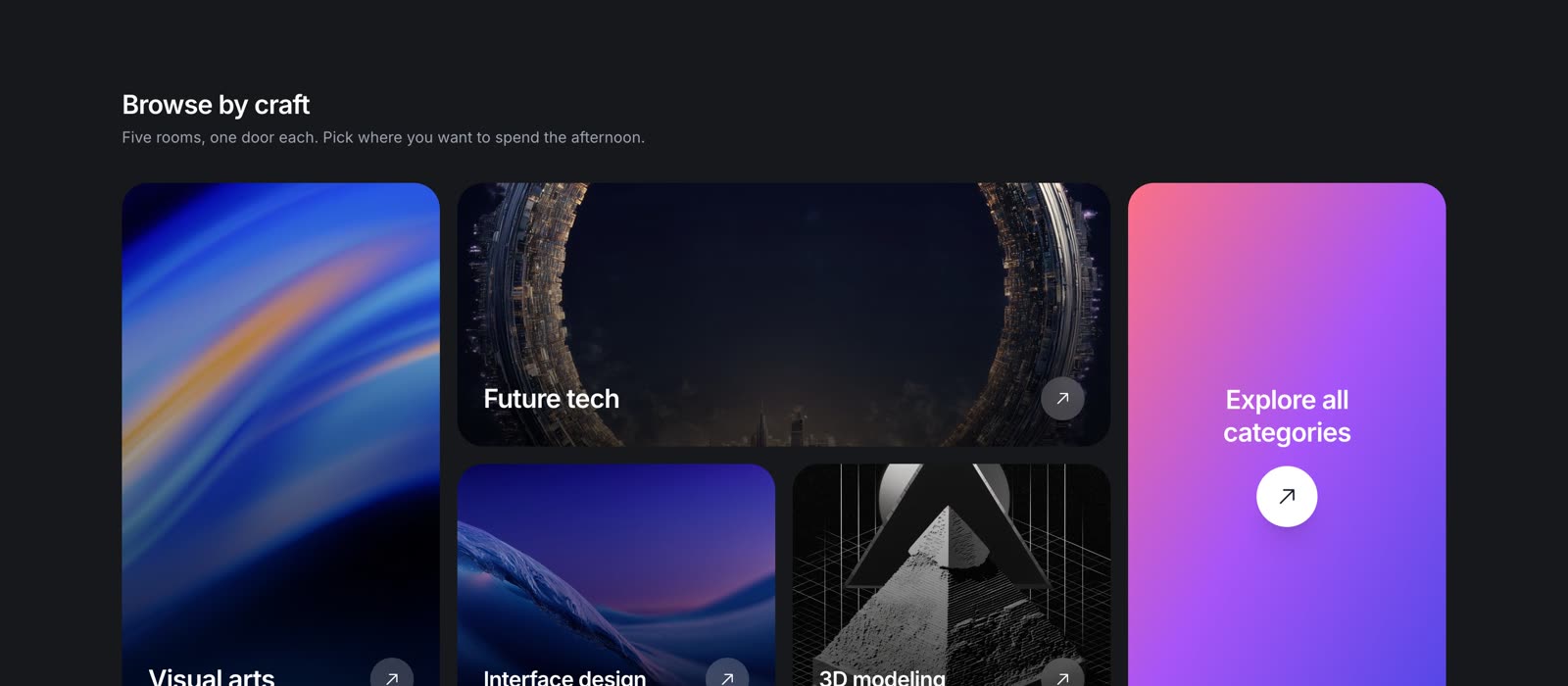
Browse by Craft
Categories organized into a visual grid, giving users a quick way to explore the marketplace based on their interests.
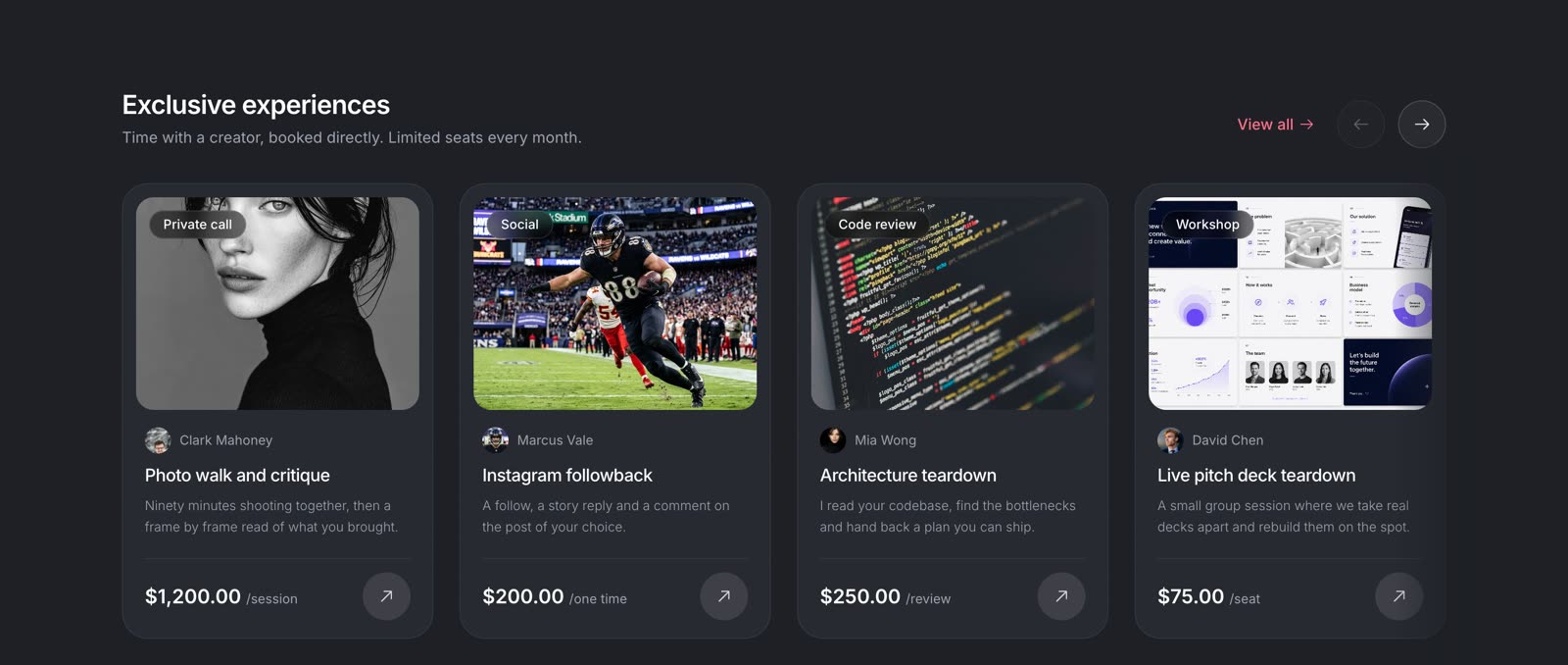
Exclusive Experiences
Bookable experiences such as private calls, code reviews, and workshops, with the format and price clearly presented.
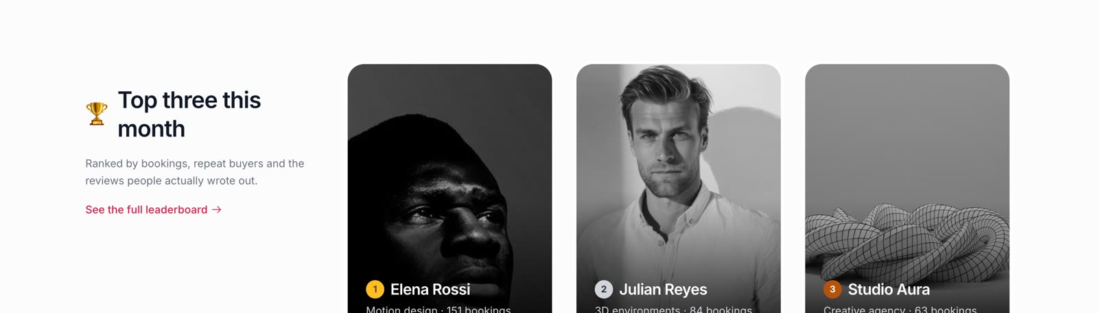
Top Creators
A creator section built around social proof, using bookings, repeat buyers, and reviews to help users discover creators with established engagement.
A validated marketplace structure, built out from research to final UI
The proposed structure was validated with both the company and its users before moving into the final design.
The company approved the direction, and I developed the complete marketplace experience from the validated wireframes into the final responsive UI.
The result was a marketplace that made the most important information easier to understand at a glance, while giving creators, experiences, and digital products a more consistent presentation.
Browse the marketplace
The hero carousel, the category rails, and the creator leaderboard, live and scrollable.
View live prototypeHave a company worth skyrocketing?
I'm open to full-time roles and looking to join a team where I can bring a decade of product design and make a meaningful impact. If you're hiring, I'd love to hear about what you're building.