- Role
- Sole Product Designer, end to end
- Scope
- Dashboard redesign
- Timeline
- 2024 to 2025
- Platform
- Responsive web
The information users needed was buried
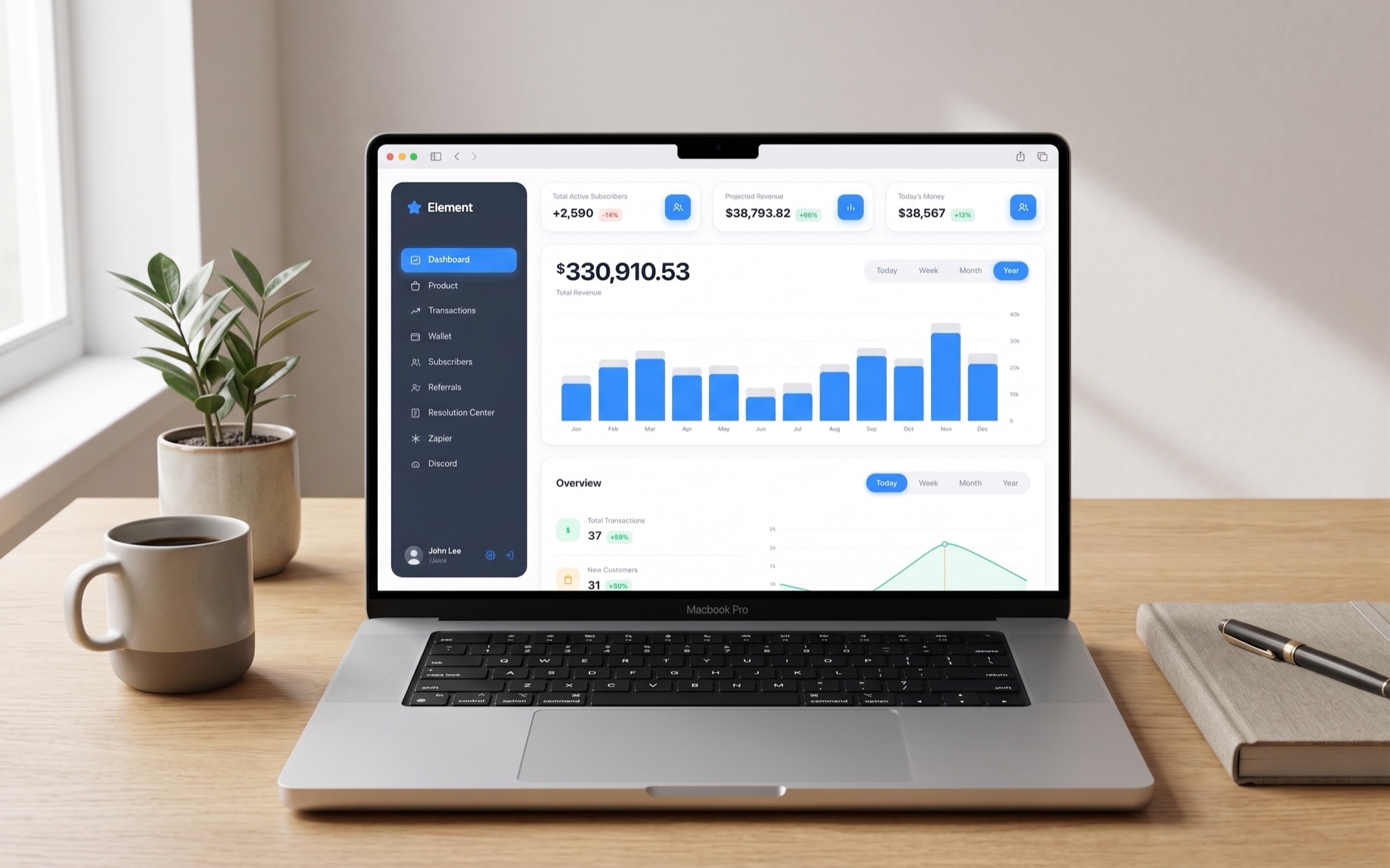
Element is a name changed here for confidentiality. Its dashboard had become dated, and the information users relied on to make decisions was several clicks away, hidden inside a dense collection of data.
The problem extended beyond the visual design. Users also had limited visibility into what was happening on the platform in real time. Sales and disputes could not be monitored as they happened, making it harder to react quickly to changes.
The redesign needed to make the most important information immediately visible while giving users a clearer picture of what was happening across the platform.
Identify what drives decisions before redesigning the interface
I started by understanding which metrics users actually relied on and which information was adding noise without helping them make decisions.
From there, I rebuilt the dashboard structure around those priorities and introduced a real time activity view to bring important events closer to the surface.
- 01
Research
Identified the metrics and information users relied on most when monitoring performance and making decisions.
- 02
Wireframing
Reworked the dashboard hierarchy around those priorities, creating space for both key metrics and live platform activity.
- 03
Validation
Tested the new structure with users before moving into visual design, using their feedback to refine the information hierarchy and layout.
- 04
Final UI
Translated the validated structure into the final responsive interface, including the typography, color system, charts, cards, and responsive states.
Key metrics up front, with live activity alongside them
The redesigned dashboard brings the information users need most to the first level of the experience, while giving them a way to monitor activity as it happens.
Overview
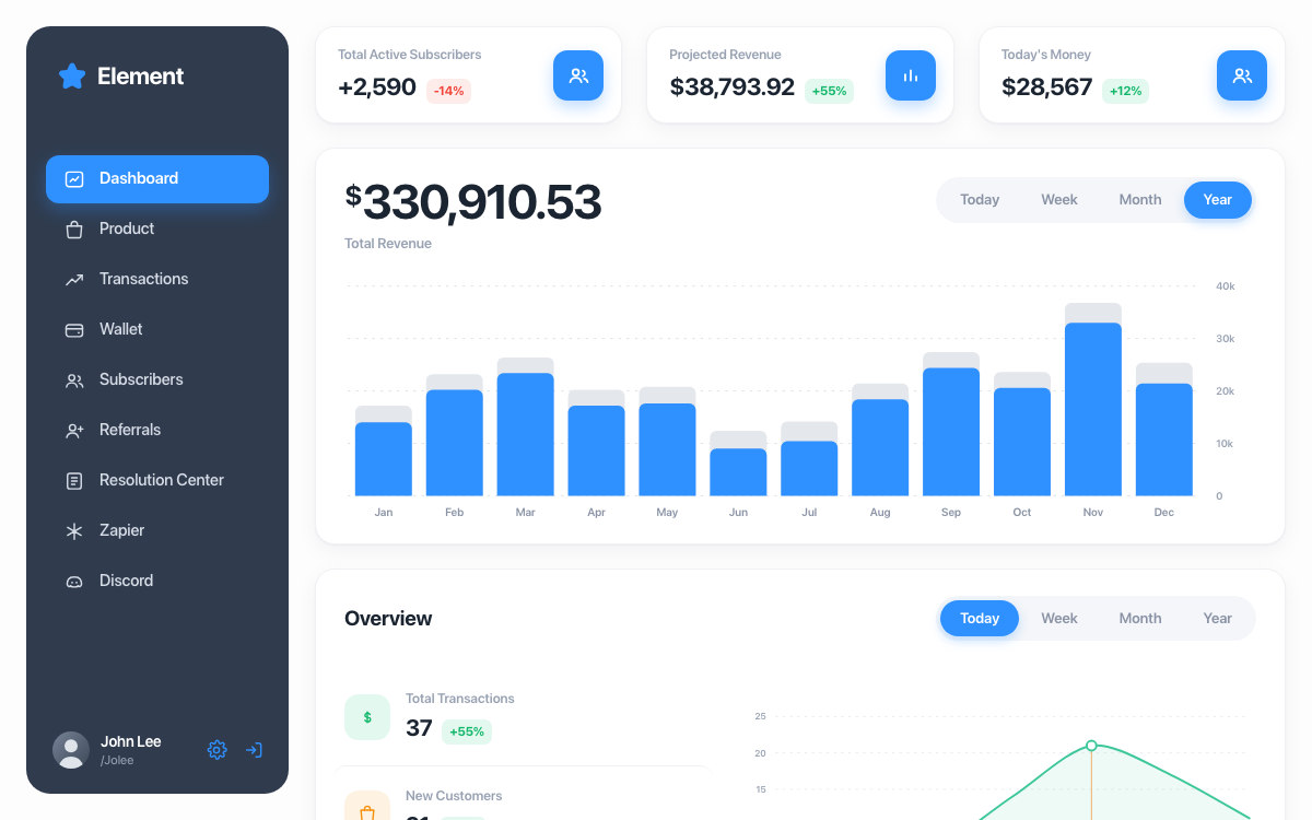
The main dashboard opens with three key metrics, followed by a revenue chart covering the selected period.
The hierarchy makes the most important information visible immediately instead of requiring users to navigate through multiple screens.
The stat cards also animate on load, giving the dashboard a sense of activity without distracting from the information itself.
Mobile
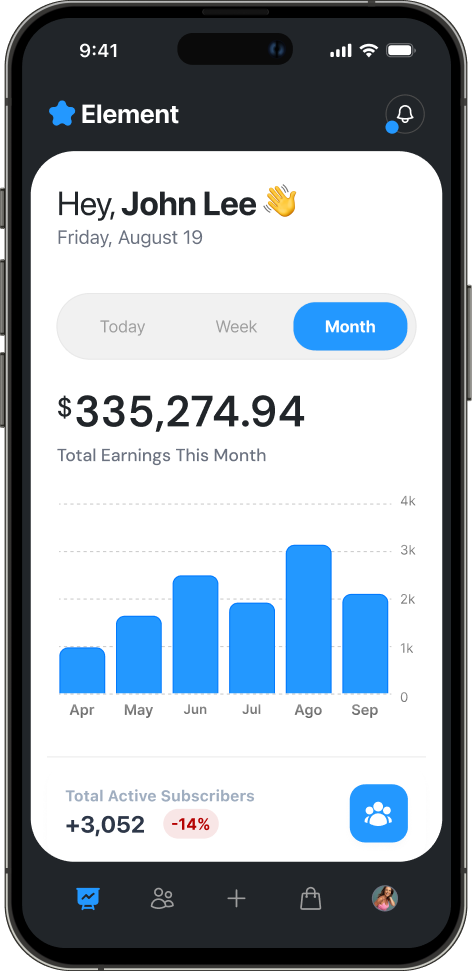
The mobile experience was designed as its own layout rather than simply compressing the desktop interface.
The period selector and chart were reorganized into a single sheet, preserving the hierarchy while making the information easier to scan on a smaller screen.
A clearer dashboard with measurable impact
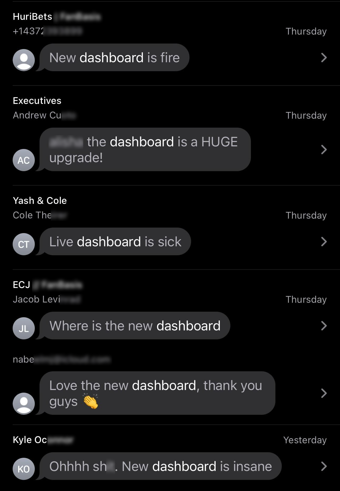
The redesigned dashboard received strong feedback immediately after launch. Within the first day, clients described it as a significant improvement, while users reported greater confidence in the information and found the new interface easier to understand.
The redesign contributed to a 20% increase in conversions.
Beyond the visual refresh, the project changed how users interacted with the platform by putting decision making information where they could see it immediately and giving them better visibility into ongoing activity.
See the numbers move
Switch between Today, Week, Month, and Year and watch the chart redraw, hover a row to spotlight its line, or just watch the stat cards count up.
View live prototypeHave a company worth skyrocketing?
I'm open to full-time roles and looking to join a team where I can bring a decade of product design and make a meaningful impact. If you're hiring, I'd love to hear about what you're building.